The meaning of colours is a deep subject. Colours can have an incredible impact on people’s lives. They play an important role in numerous aspects of our lives. The use of these in designs is very important and has a lot of impact on consumer behaviour. For example, a colour that gives peace to one person may cause sadness to another because of culture, association or even just individual preferences.
The theory of colours and their meanings, on the other hand, is a field of research in itself, so vast that corporate identities can be built on it and designers can devote their entire careers to it. Knowing the effects of colours and their meanings on consumers is seen as incredibly valuable expertise that designers can master and offer brands. In this post, we will take a look at the meanings of colours with their effects that can completely change your product designs such as business cards, brochures or catalogues, and how you can use them in your designs.
The Meaning Behind Colours: All You Need To Know
Colours and their meanings
Did you know that yellow raises your energy and makes it easier to focus, while blue helps you calm down and relax? Canvas prints of paintings with lots of shades of blue will be a great addition to any meditation room. Since colours are associated with both emotional and psychological reactions, it becomes very important to know their effects and meanings when using them.
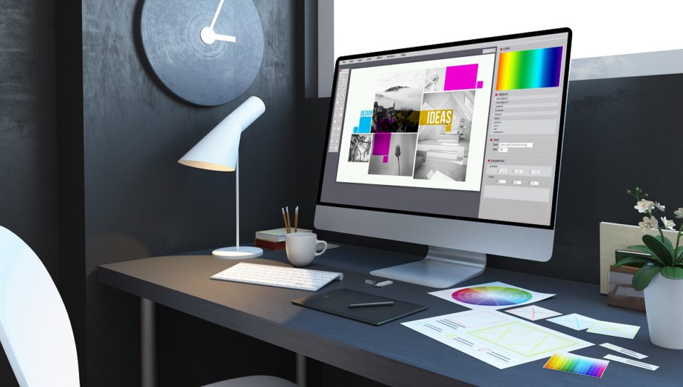
Before using colours with a powerful and transformative touch in your designs, it is useful to discover colours and their meanings.
Neutral colours
Neutral colours do not appear on the colour wheel and are generally known as colourless. They symbolize relaxation, neutrality and peace. It is preferred to complement or highlight the primary colours rather than being used side by side.
Black
Black is the strongest of the neutral colours and is often associated with power, elegance and formality. Depending on the colours it is combined with, it can mean retro or modern, traditional or unconventional. In designs, you can use black to complement the dominant colour palette and to highlight the text or symbols you want to draw attention to.
White
Compatible with almost any colour, white is often associated with purity, cleanliness and virtue. In the design, white is mostly used as a neutral background that makes other colours stand out. It is an excellent option for those who prefer minimalism in designs that emphasize cleanliness and simplicity.
Beige and Ivory
Beige is reliable, restrained and harmonious. The qualities and meanings associated with this colour which is neutral, calm and relaxing, vary according to the colours it accompanies. Beige colour carries the warmth of brown and the vitality and coolness of white. Although it is a relaxing colour, beige is often seen as a dull and boring colour.
Another neutral, comforting and calming colour similar to beige is ivory. It has the purity and softness of white but in a warmer tone. Ivory represents peace and contentment. In designs, on the other hand, it emphasizes a simple elegance and is pleasing to the eye.
Gray
Gray is a cool, neutral and balanced colour. It is associated with formality, restraint, and sophistication. A timeless colour, gray is ideal for a complimentary touch and to be used as a ground colour.
Cool colours
The cool colours green, blue and purple represent darkness, water and nature. They are known for their calming and relaxing effects. You can choose cool colours to give a sense of peace or harmony in your designs.
Green
The colour of life, renewal, nature and energy, green is associated with growth, harmony, freshness, security, fertility and the environment. Green also traditionally represents money, finance, banking and greed.
Green is believed to possess healing powers and is said to be the most restful and comforting colour for the human eye. Green, the most dominant colour in nature, is an ideal background choice for designs. Because people are used to seeing green everywhere.
Green is often used to indicate safety in the design and advertising of drugs and medical products. It is also preferred to represent and promote environmentally friendly and organic products as it represents nature.
Blue
Blue is used extensively in design to represent a sense of balance and responsibility. Light blues are refreshing and friendly, while dark blues reflect strength and reliability. The meaning of this colour changes depending on its hue.
The tone of blue you use in your designs will have a great impact on the energy that the overall design will radiate. Light blues are often relaxed and calming. Bright blues can be energizing and refreshing.
Dark blues such as navy are perfect for designs made for companies where strength and reliability are important.
Purple
In ancient times, the pigments used to create purple and its shades were obtained from snails and were very expensive. Therefore, only royal families, nobles, and the very wealthy could afford this expense. As a result, purple has become a symbol of wealth and nobility.
The lighter tones of the colour, which are also associated with creativity and imagination, reflect sincerity. In designs, dark purples are preferred to add a luxurious atmosphere to the image. You can use purple abundantly in catalogue designs with its soothing, relaxing, and romantic effect.
Warm colours
Warm colours include red, orange, and yellow, as well as variations of these three colours. Warm colours, which are often energizing, passionate and positive, are also used to reflect happiness, enthusiasm and energy.
Red
The warmest colour, red, is so strong that it can even have a physical effect on people. It has been seen in various experiments that red colour increases blood pressure and respiratory rhythm and accelerates metabolism.
This remarkable colour is associated with importance; assertive, daring, determined, energetic, strong, enthusiastic, impulsive and exciting. When featured in red designs that symbolize action, confidence and courage, it quickly grabs the attention of consumers and enables them to make quick decisions.
Red, which is used in designs that represent important official institutions and individuals, is also highly preferred in the food sector with its energizing and appetite increasing properties.
Orange
Orange, on the other hand, is a vibrant and energetic colour and is associated with the earth and autumn. Due to its relationship with the changing seasons, it generally reflects the dynamism and processes. It is also strongly associated with creativity. Therefore, the use of orange in designs represents productivity and motivation.
Yellow
Yellow is considered the brightest and most energizing among the warm colours. This colour, which is associated with happiness and sunlight, can be preferred in designs to give a sense of happiness and joy. Pastel yellows are often used in the design of baby and children’s products, as a gender neutral colour, instead of blue or pink. Soft tones of yellow can be preferred in designs to radiate a calm energy of happiness.
Use of colour in Design
Designers should create a colour palette for each design they make. Concepts such as hue, purity, saturation and contrast are the elements that need to be known to create creative and successful designs. We can give detailed explanations of some concepts as follows:
- Hue: the most basic of colour terms, it denotes the colour of an object. When we say “blue,” “green,” or “red,” we are talking about hue. The tones you use in your designs have the effect of changing the messages conveyed to your brand’s customers or consumers of printed products.
- Purity (chroma): A colour with high chroma has no additions of black, white or gray. Conversely, adding white, black, or gray reduces chroma. This concept is similar to saturation, but not the same. You can think of Chroma as the brightness of a colour compared to white.
Avoid using colours that are similar but not of the same purity in your designs. Instead, choose colours with exactly the same or very similar purity.
- Saturation: Refers to how a colour appears at certain lightness levels. You can express saturation as weak, strong, or pale.
Colours with similar saturation levels in the design create designs that look more cohesive.
- Shadow: Adding black to a tone creates a shadow that darkens the colour. Technically, shade refers to colours that are only darkened by the addition of black.
To summarize:
- Hue includes colours such as blue, green, red.
- Purity (chroma) is the purity of a colour, meaning that black, white or gray is not added to the colour to achieve high purity.
- Saturation refers to how strong or dim a colour is; High saturation means strong colour.
- The value indicates how light or dark a colour is. For example, a higher value indicates a lighter colour.
- Softness (tone) is created by adding gray to a colour; which makes it paler than the original.
- A shade is created by adding black to a colour, making it darker than the original.
- A lightness (tint) is created by adding white to a colour, making it lighter than the original.
Knowing colours and their meanings while designing will enable you to get creative with your designs.